Home

›

›

DigitalOcean

DigitalOcean

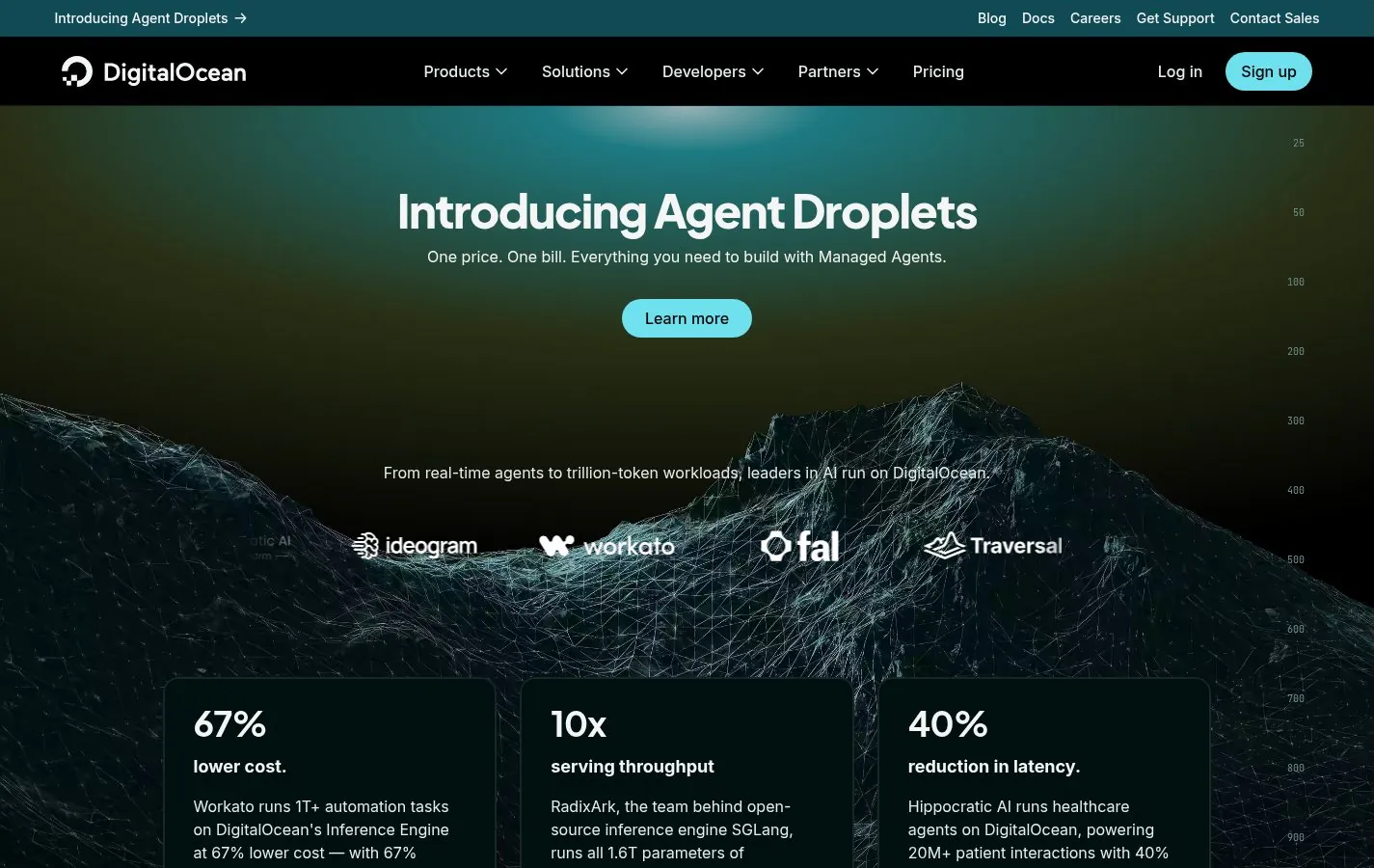
DigitalOcean uses a dark, misty landscape behind a short headline, “AI-Native Cloud,” and a row of partner logos.

First screen of the DigitalOcean homepage at desktop width
The first screen at a desktop width of 1440 pixels, captured in November 2026.

TypeSaaS

StyleDark, Atmospheric

PageHomepage

Addressdigitalocean.com

Further down, large figures in a three-column grid turn performance claims into something you can scan. The display face is Plus Jakarta Sans with Inter for body copy, a clean pairing worth noting for technical brands.

Part of the SaaS gallery. Every site in the gallery is chosen and annotated by hand; here is how.

Other options in this market

Other options in this market

  • Linear

    Linear opens on a near-black canvas with a single line of large Inter type: “The product…

  • Stripe

    Stripe still owns the flowing gradient that half the industry copied.

  • Notion

    Notion pairs a very large headline, close to 90px, with small hand-drawn sketches and a highlighted…

  • Vercel

    Vercel’s homepage is almost entirely black and white: a two-word headline, “Agentic Infrastructure,” set in Geist,…

Dan Strand Avatar