A gallery of real websites
Real websites, studied closely.
Fifty live sites in five types, each with a full screenshot of its first screen and a short note on what it does well. No templates, no paid placements: just good design you can learn from, and a blog that explains how it works.
SaaS
Software homepages that explain an abstract product in one screen.

Linear
Linear opens on a near-black canvas with a single line of large Inter type: “The product development system for teams and agents.” Below it sits a real slice of the product, not an illustration of it.


Portfolio
Personal sites where the site itself is part of the work.
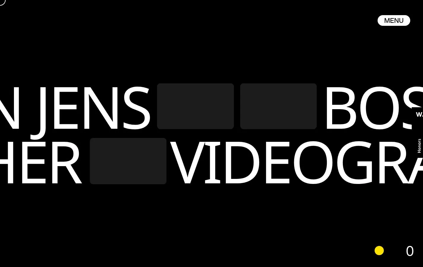
Jens Bosman
A videographer’s site built on giant white capitals over black, with black blocks cutting through the words like edit marks.

Clay Boan
Clay Boan puts a huge blackletter “CLAY” in the middle of a black screen and keeps everything else tiny.
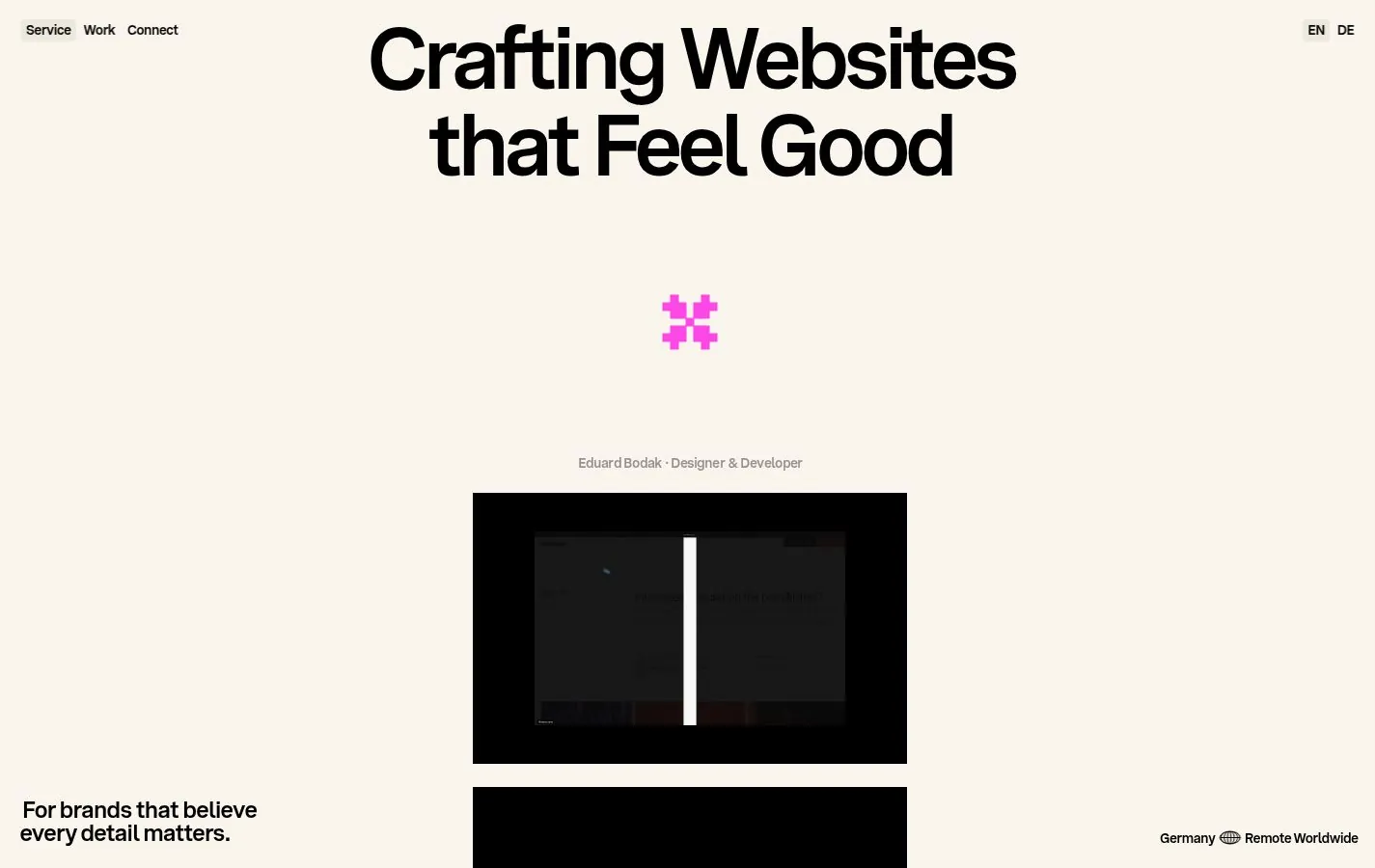
Eduard Bodak
A designer and developer from Cologne with a simple promise: “Crafting Websites that Feel Good.” Cream background, one pink mark and a large centred headline.

Clément Grellier
The name runs across the full width as a single word, “CLEMENTGRELLIER,” at more than 110px.
Ecommerce
Stores that make you want the product before you scroll.

Patagonia
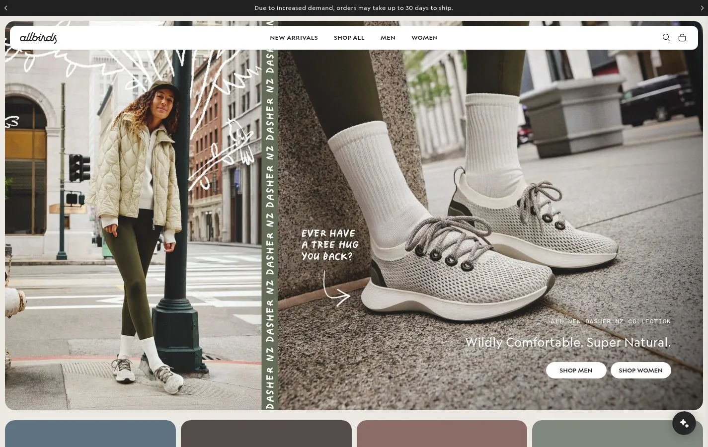
Patagonia leads with one product category, “Fleece,” over a candid outdoor photo, with simple pill buttons for Women’s, Men’s and Kids’.


Magazine and Blog
Publications that make reading a pleasure, on any screen.

Hunger
Hunger is a fashion and culture title that keeps the homepage simple: a large cover star on the left, smaller stories on the right, and a light grey background.

WIRED
WIRED uses a dense, multi-column news layout with a strong lead story in the centre and narrow columns of headlines on each side.

The New Yorker
The New Yorker carries its print identity onto the web almost untouched: its Caslon typeface, plenty of white space and a lead story built around a photograph and a pull quote.
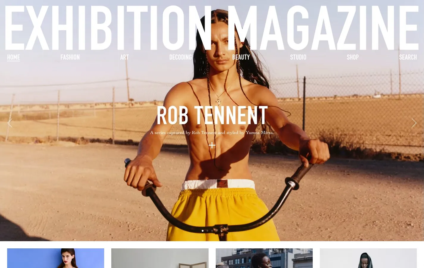
Exhibition Magazine
The masthead runs edge to edge in tall condensed capitals over a full-bleed fashion photograph.
Landing Page
Pages built for a single action, most of them the destination of an ad.
Shopify: Free Trial
One message, “Your business starts with Shopify,” one email field and one button, all floating over a collage of real merchant photos.
Loom: Mac Screen Recorder
The headline repeats the search term almost word for word, “Free Mac Screen Recorder,” which is exactly what a paid-search visitor wants to see.

Airbnb: Host Your Home
Airbnb turns the landing page into a calculator: a big estimated earnings figure, a slider for nights per month and a map of the local market.
Semrush: Traffic Analytics
A centred headline, “Analyze your competitors’ website traffic,” a domain input and a “Try free for 7 days” button.
Guides
The gallery shows what good design looks like. The guides explain why it works and how to do the same on your own site, one topic at a time.
-
Website Design Inspiration: The Best Sites by Type
Good inspiration depends on the kind of site you are making. A guide to studying SaaS homepages, portfolios, stores, magazines and landing pages, with fifty real examples.
-
Web Design Elements: A Visual Guide with Real Examples
Every website is built from the same parts: a hero, navigation, type, colour, images, buttons and a footer. How each one works, with examples from real sites.
-
Web Design Trends for 2027: What Is Here to Stay
The trends that show up again and again across fifty real websites, which ones are likely to last into 2027, and which are already on their way out.
-
How to Design a Website: A Practical Guide from Real Examples
A step-by-step way to design a website, from deciding what it is for to checking it on a phone, with lessons taken from real sites in the gallery.
-
WordPress Website Design: How to Get a Custom Look Without Code
WordPress sites only look generic when they are built that way. How block themes, global styles and patterns let you get a distinctive design without writing code, with real examples.
Chosen by hand
Every site here was picked and annotated by Dan Strand, who built websites for clients for years before he started making themes and tools of his own. Nobody pays to appear in the gallery, and every note says what is worth borrowing, not just what looks nice.