An online store has to do in one screen what a shop window, a sales assistant and a returns policy do in the real world. It has to make the product desirable, make the next click obvious and quietly answer the doubts that stop people from buying. The stores in this gallery handle that balance in different ways.
Patagonia, Passenger and Allbirds sell a way of life before they sell a product. Ooni and The Fish Society put the offer and the guarantees right at the top, because their buyers need reassurance first. Charlotte Tilbury, Sous Chef and Space NK show what strong art direction does for a brand that lives on its look. Each entry has a screenshot of the first screen and a note on what it gets right.

Patagonia
Patagonia leads with one product category, “Fleece,” over a candid outdoor photo, with simple pill buttons for Women’s, Men’s and Kids’.

Away
Away uses a single macro photograph of a suitcase detail with the line “The best, made better.” in capitals.

Ooni
Ooni puts the offer front and centre, “Price Drop,” over a pizza oven in action, then follows with a row of trust signals about shipping, returns and guarantees.
Gymshark
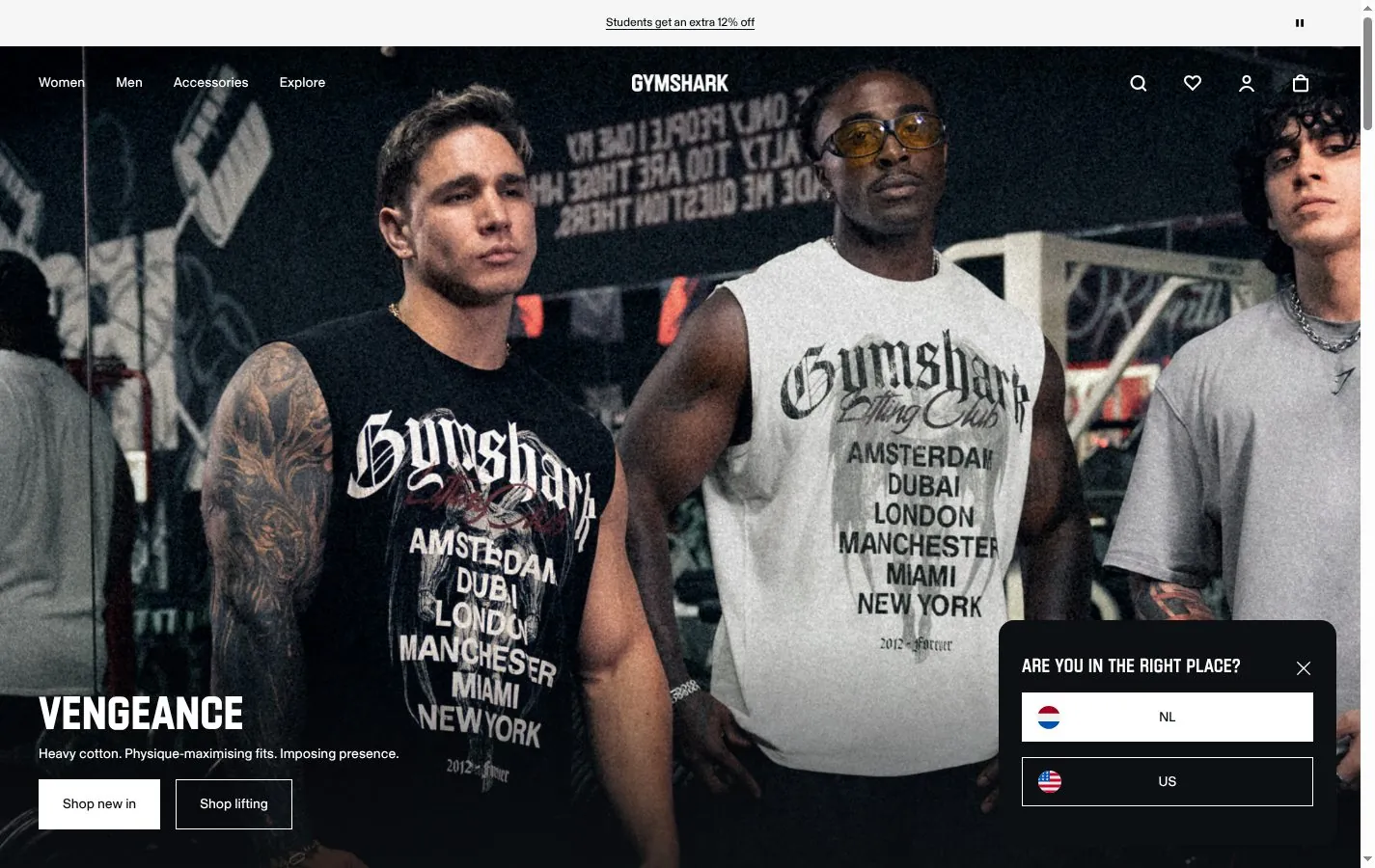
Gymshark opens with a campaign image, a group of athletes in matching black tees, and a rotating promo bar above it.
Passenger
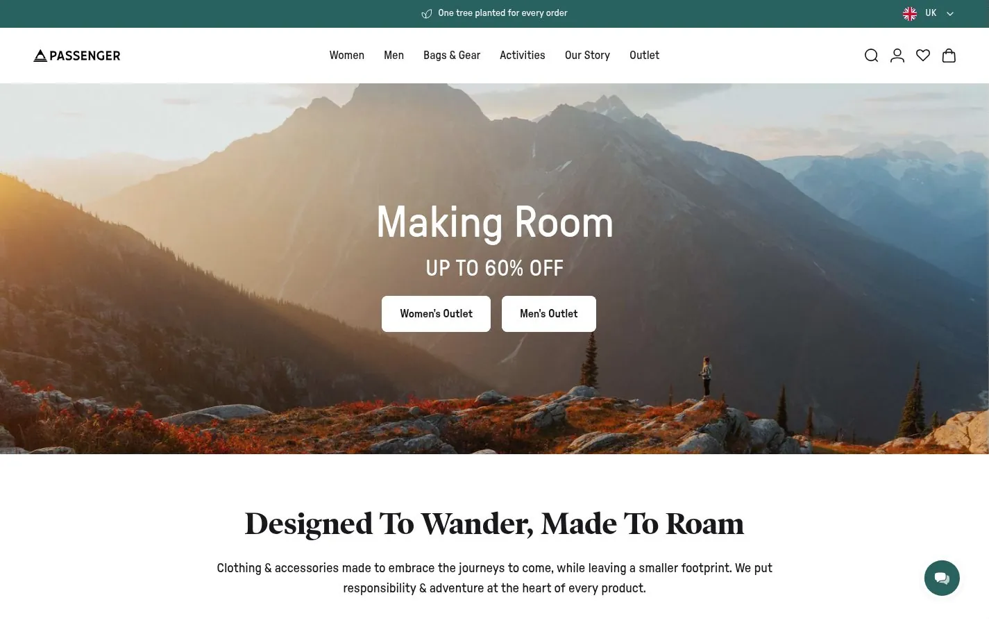
Passenger uses a wide mountain landscape behind a short sale message and two clear buttons.

Sous Chef
A cooking shop with a strong art direction: a bright still life of products against a deep red background, a green header band and the friendly La Nord typeface.

Space NK
Space NK swaps product photography for a full-bleed illustration in its seasonal campaign, a moon and a gift bag in pink and blue.
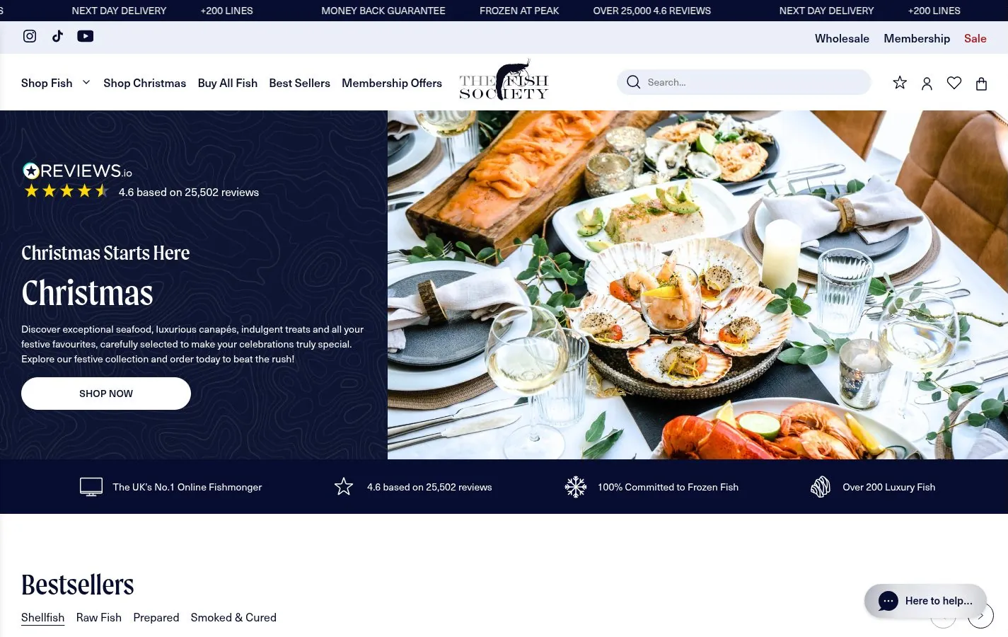
The Fish Society
A frozen fish retailer that solves its biggest problem, trust, with a scrolling ticker of proof points: reviews, next day delivery, range, money back guarantee.
Every entry in this gallery also appears in the Ecommerce listing, sorted with the rest of the gallery, and in the full gallery.