A software homepage has a harder job than most. The product cannot be held or tasted, so the first screen has to show what it does, who it is for and what to do next, usually in less space than a single paragraph. The ten sites below solve that problem in very different ways.
Some lead with the product itself: Linear, Figma and Miro put a real slice of the interface where other sites put an illustration. Others lead with a voice: Basecamp and Gumroad sound like nobody else, and the design follows the writing. Stripe and Vercel show how far a strong brand mark and confident typography can carry a technical offer. Each entry has a full screenshot of the first screen and a short note on what is worth borrowing.

Linear
Linear opens on a near-black canvas with a single line of large Inter type: “The product development system for teams and agents.” Below it sits a real slice of the product, not an illustration of it.


Notion
Notion pairs a very large headline, close to 90px, with small hand-drawn sketches and a highlighted word inside the sentence.

Vercel
Vercel’s homepage is almost entirely black and white: a two-word headline, “Agentic Infrastructure,” set in Geist, and the brand triangle as the only graphic.

Figma
Figma sets “The full-stack creative canvas” in its own typeface beside a stack of overlapping design files that show the product at work.

Basecamp
Basecamp breaks the usual SaaS rules on purpose. The first screen is packed with a real project view, a list of plans and plain-spoken copy, and the headline sits lower and smaller than you would expect.
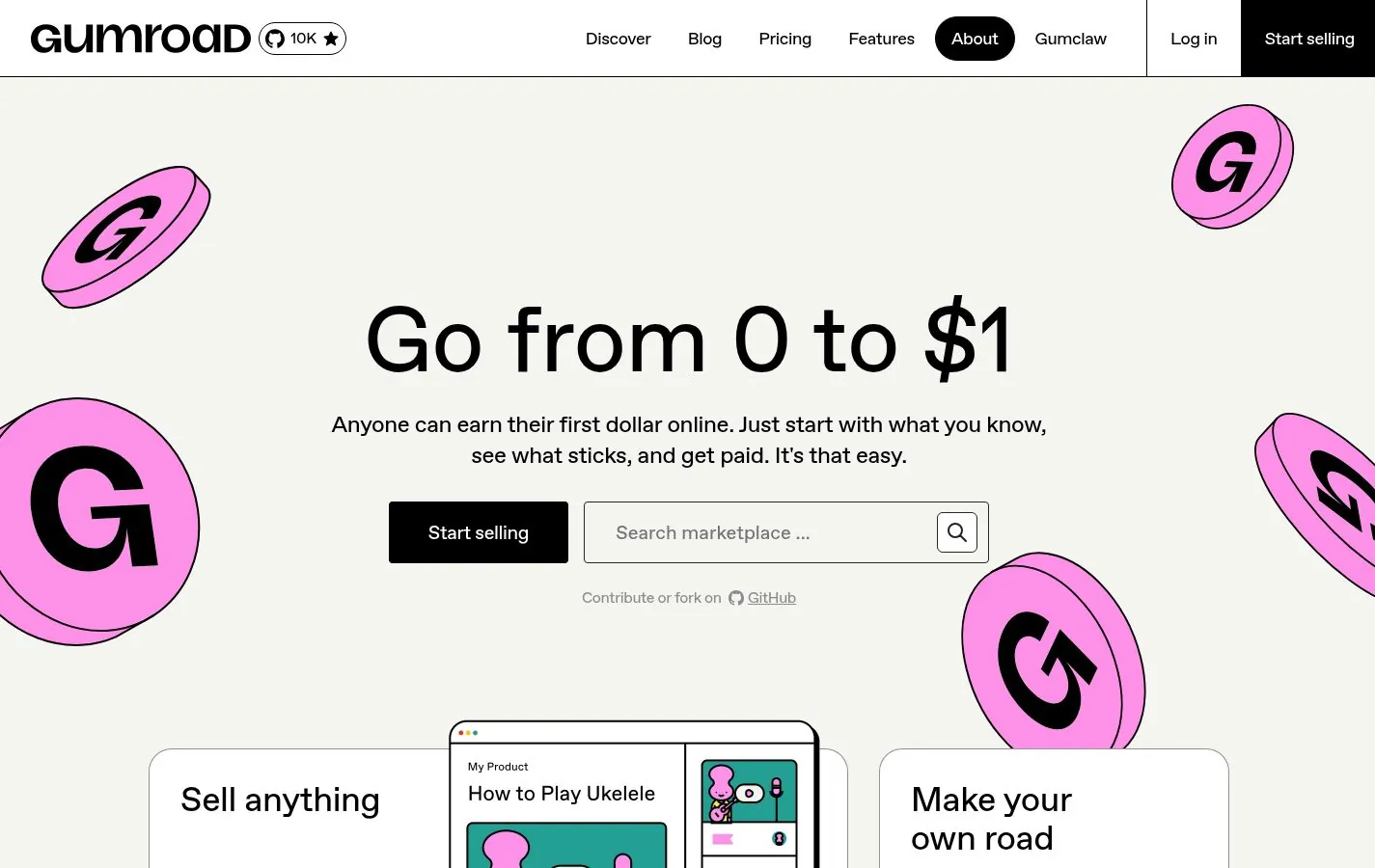
Gumroad
Gumroad leans into fun: “Go from 0 to $1” in 96px type, a warm off-white background and big pink coins scattered around the edges.
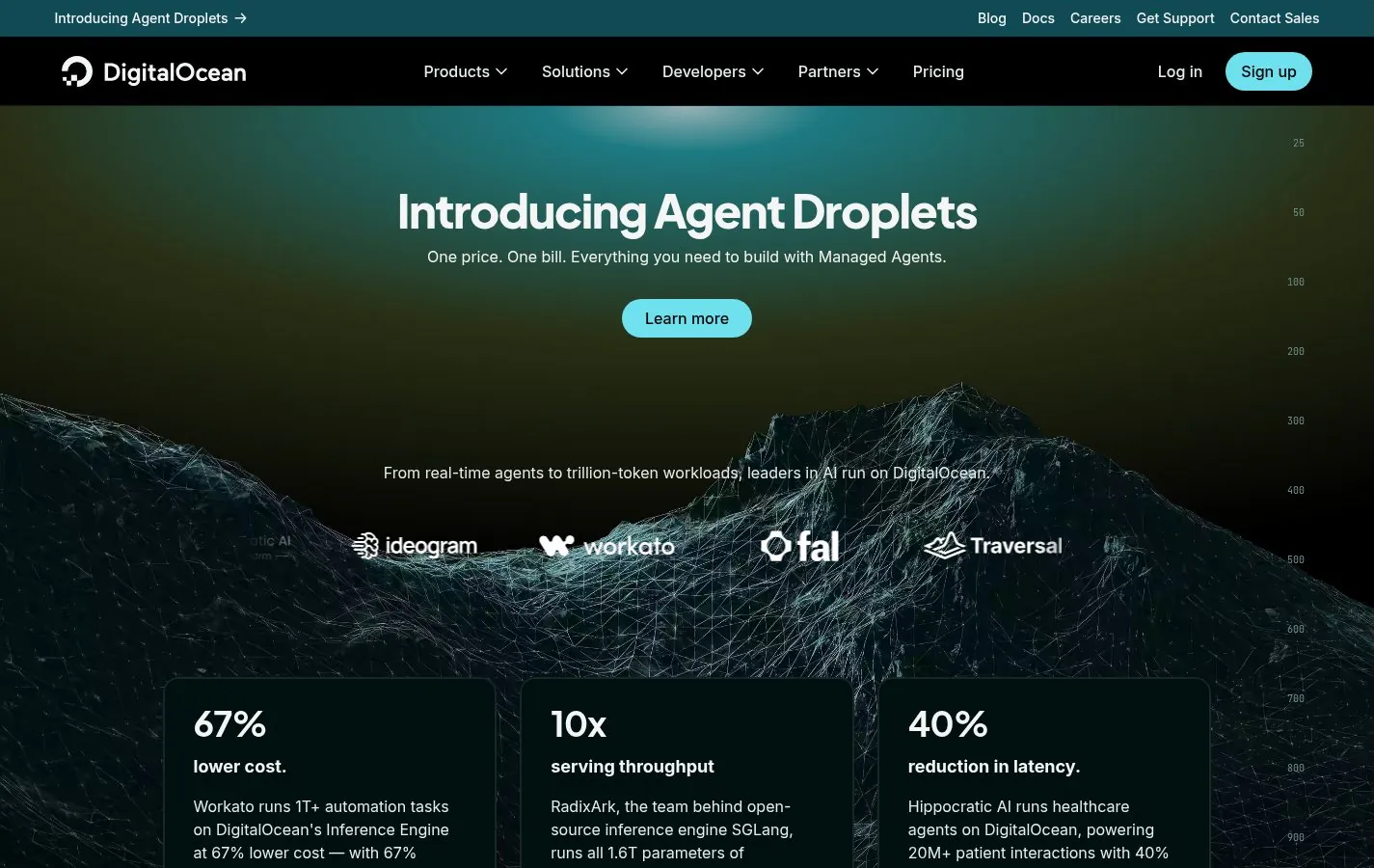
DigitalOcean
DigitalOcean uses a dark, misty landscape behind a short headline, “AI-Native Cloud,” and a row of partner logos.

HubSpot
HubSpot sets its headline in a serif, which is unusual for software, and pairs it with an orange primary button and photographs of real people.

Miro
Miro keeps the brand yellow for a thin announcement bar and lets the canvas product fill the hero.
Every entry in this gallery also appears in the SaaS listing, sorted with the rest of the gallery, and in the full gallery.